Fine Art Photography
# How to Choose Large Format Fine Art Photography for Your Home or Office
The most common mistake collectors make when buying fine art photography isn’t choosing the wrong image. It’s choosing the right image in the wrong size.
I’ve been advising collectors, interior designers, and hospitality clients for two decades, and I see it consistently: a stunning photograph purchased at 16×24 inches for a wall that needed 40×60. The image, which would have commanded the room, instead competes with the furniture. It disappears. And instead of feeling something every time you walk past it — which is the only real purpose art has in a home — you stop seeing it within a few weeks.
A large format fine art photography print is not simply a bigger version of a small photograph. It is a fundamentally different experience. Getting the scale right is the single most important decision in the entire buying process.
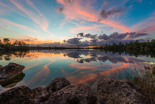
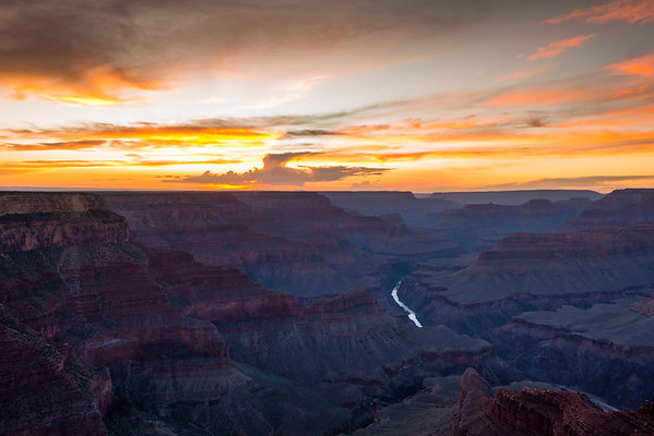
When I photograph the Everglades at dawn, or the Grand Canyon at last light, or the cliffs of Meteora rising out of the Greek plain, the experience is defined by scale. The grandeur of these places is physical — it involves your entire field of vision, not just the center of it. A 16×24 print asks your eyes to look at a landscape. A 40×60 print asks you to enter one.
At large enough dimensions, a well-made photograph stops being a representation of a place and starts being a portal to it. Museum curators understand this, which is why the large-format tradition in fine art photography — from Edward Weston to Andreas Gursky — has always pushed toward the monumental. The images that stop people in their tracks in a gallery are almost always large.
The same principle applies in your home. Art should make you feel something every time you walk past it. That visceral quality is far more accessible at scale.
After two decades of working with collectors and designers across residential, commercial, and hospitality projects, I’ve developed clear guidelines for matching print size to space. These are grounded in viewing distance, wall proportion, and the specific demands of each environment.
| Room | Recommended Size | Notes | |—|—|—| | Living room focal wall | 40×60″ or larger | Should command the space, not compete with it | | Home office | 24×36″ | Close enough to study detail; energizing subject works well | | Hotel lobby / commercial | 60×90″+ | Statement piece; scale communicates brand confidence | | Bedroom | 20×30″ | Intimate, calming subjects; horizontal format preferred | | Dining room | 30×45″ | At eye level when seated, or as a vertical accent | | Hallway / gallery wall | 20×30″ each | Series of 3–5 works; consistent framing throughout |
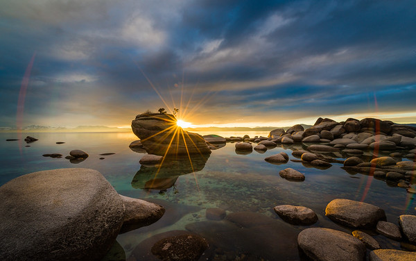
The most common error in residential installs is undersizing the focal wall. If your living room wall is 12 feet wide and 9 feet tall, a 24×36 print in the center of it will look like a stamp on an envelope. The minimum for a wall that size, used as a single statement piece, is 40×60. For my landscape images — Grand Canyon, Everglades, Lake Tahoe, Meteora — I recommend the largest format the space will support. These subjects earn their power through the suggestion of vastness, and the larger the print, the more completely they deliver on that promise.
Once you’ve determined the correct size, the next decision is print medium. Each has distinct visual characteristics and suits different spaces.
Archival Giclée on Fine Art Paper is my preferred medium. Hahnemühle Photo Rag and baryta papers produce depth of tone and color accuracy that is unmatched for atmospheric landscape photography. The surface texture gives the image a quality reminiscent of fine printmaking — authoritative without being flashy. These prints suit contemporary interiors with natural materials: stone, wood, linen. They should be framed or mounted behind UV-protective glass.
Metal Prints (aluminum with UV-coated dye sublimation) produce high contrast and brilliant color with a characteristic sheen. They work well for architectural and urban imagery. For landscapes with subtle tonal gradations, metal can over-saturate and lose the nuance that makes the image work. Best for modern or industrial spaces.
Acrylic Face-Mounts — where the print is bonded face-down to optically clear acrylic — produce luminosity that approaches a backlit display. Colors appear to come from inside the image. Best for subjects with water or sky as central elements, and for contemporary high-design spaces. No framing required.
For most residential applications, I recommend archival giclée on fine art paper. It is the most versatile medium and the one that holds up best over decades.
A limited edition print has a defined, fixed number — my editions are typically 50 across all sizes. Once that number is sold, the image is retired permanently. No reprints. Each print is numbered, signed by hand, and accompanied by a certificate of authenticity.
An open edition print can be reproduced indefinitely. It has no inherent scarcity and therefore no investment-grade value. It functions as décor, not as a collectible.
The practical difference: a limited edition large format fine art photography print appreciates in value as the edition closes. Early buyers acquire at the lowest price and hold a print that becomes rarer over time. An open edition print does not appreciate — it is worth approximately what you paid for it, indefinitely. If you are serious about what you put on your walls, the edition structure matters.
Lighting is consistently underestimated. A $10,000 fine art print on a poorly lit wall looks worse than a $500 print on a well-lit one. For archival giclée prints, use a museum-grade picture light or a recessed track with a color-accurate LED at 3000K–3500K, positioned at roughly 30 degrees from the perpendicular. For acrylic face-mounts and metal prints, ambient lighting works better than directional. Avoid direct sunlight — even UV-protective glass and archival inks have limits.
When you purchase from a gallery, 40 to 50 percent of the price goes to the gallery’s overhead. When you purchase directly from me, that margin disappears. You get the same print, the same edition, the same certificate — at a price that reflects the actual value of the work. More importantly, you can talk to me. I can advise on size, medium, subject, and installation for your specific space — something no gallery can offer.
If you’re ready to find the right print for your space, I’d be glad to help. Browse the full collection and reach out with any questions — I answer personally.